Scaelife
Cross-platform software for long-term care facilities, used by the caregivers who record residents’ health on shift. The challenge was designing for a nurse with ninety seconds between tasks, after a brief that described someone else.
- Services
- Product design, Landing page, Blog, Mobile app
- Year
- 2019
- Problem
- Caregivers wrote everything in a notepad, on paper or from memory and typed it into the system later, and information was lost on the way. The brief described a different user.
- What I did
- Interviews with caregivers, then a mobile app built around the resident that records care in real time, plus the landing page and the blog.
- Result
- +60% engagement, an NPS of 75 and 45% fewer support requests, measured by Scaelife three months after launch. The app is still live.
- Role and team
- Sole designer, hired directly, working with the founder and two to three developers. About three months.
The brief described someone else.
The brief pictured the elderly resident as the person using the app. The interviews showed that the person holding the phone was the caregiver on shift, and every decision after that point was made for the caregiver.
A notepad, a memory, then the system.
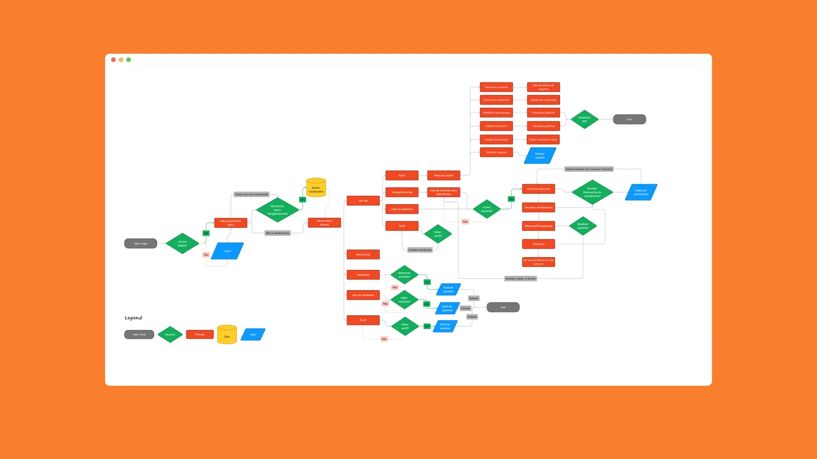
Before the app there was no navigation to improve. Caregivers noted everything in a notepad and typed it into the system later. Some used paper, some relied on memory, and information was lost between the bedside and the record. The app moves the record to the moment of care, in one place and in real time.
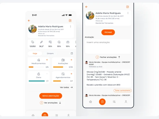
The resident is the entry point.
Health tracking, messaging, scheduling and records open from the person being cared for, the way caregivers already organise their shift.
Ninety seconds between tasks.
Designing for an eighty-year-old concerns type size, contrast and pacing. Designing for a nurse on shift concerns the number of interactions between an observation and a saved record.
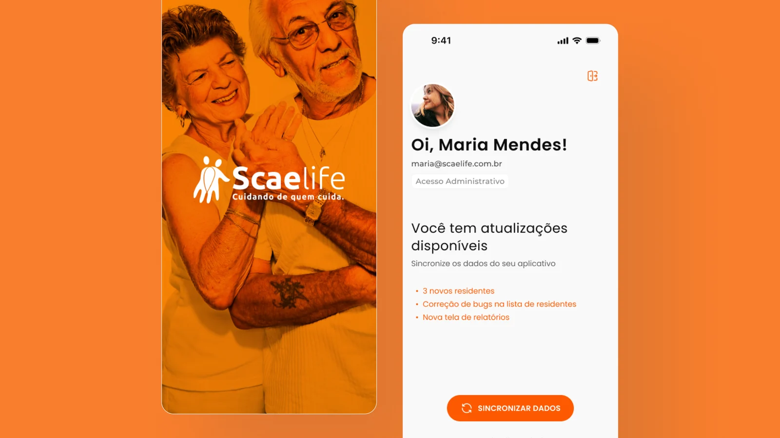
Three stakeholders, one user
The caregiver is the only one who operates the interface. Products with this shape are frequently designed for the buyer or the beneficiary and abandoned by the operator.
The resident
The beneficiary.
The family
An audience. The app is opened in their presence.
The facility
The customer.
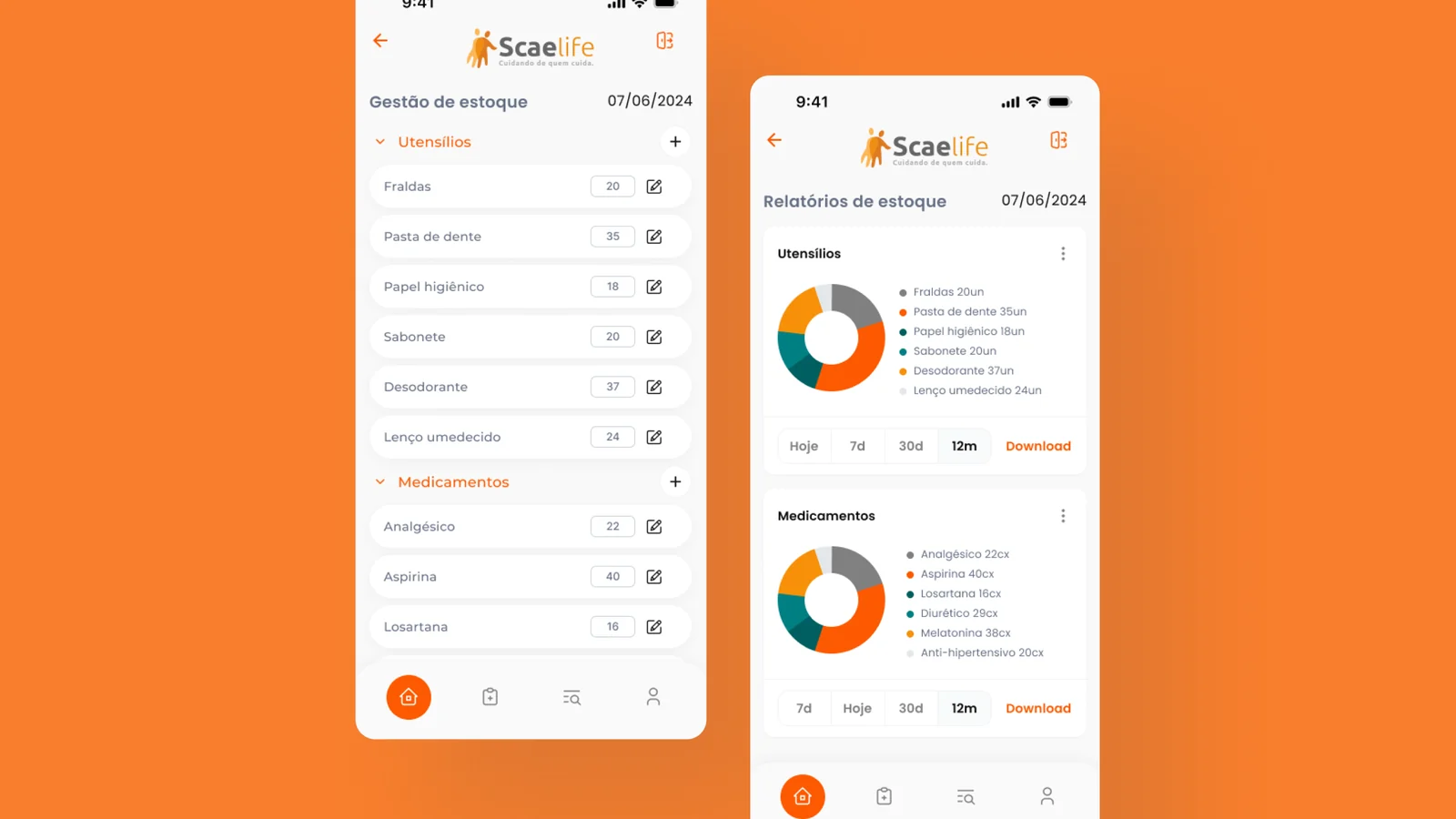
Three motivations
The job: record care as it happens, so nothing is lost before the shift ends.
Functional
Save an observation in the seconds between two tasks.
Emotional
End the shift knowing nothing was left out.
Social
Look professional in front of the family. This one set the visual register of the app.
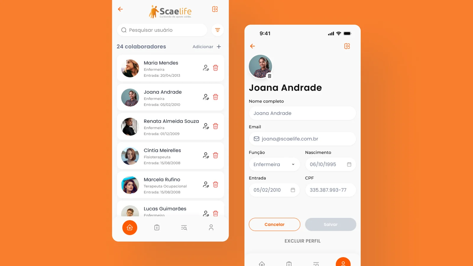
Impact
Measured by Scaelife three months after launch.
- +60%
- User engagement.
- 75
- NPS after three months, citing improved health notes for residents.
- −45%
- Technical support requests.
Company valuation doubled.
The figure originates with the business and reflects several contributing factors. It is included because it traces to the research finding: resolving the caregiver’s time constraint sustained facility renewals, and recurring revenue underpins the valuation.